How Not to Build a Website (That Actually Loads)
So, you want to build a website? That’s adorable. Just remember — speed, functionality, and user experience are totally optional. In fact, if your goal is to confuse visitors, frustrate search engines, and watch your bounce rate soar into the stratosphere… you’re in the right place.
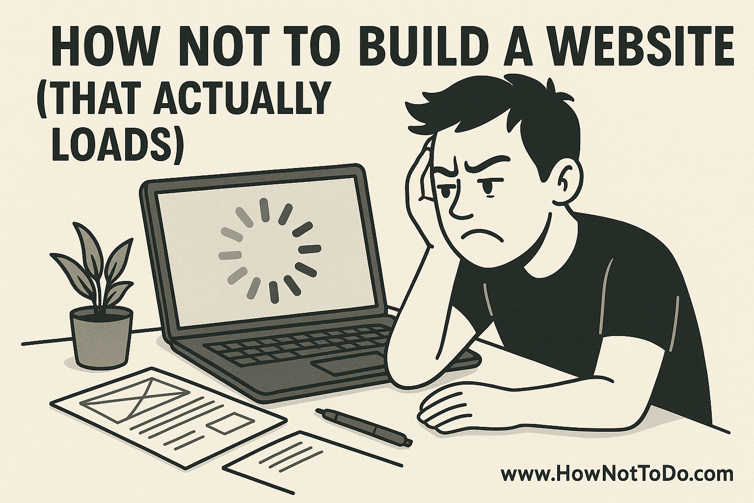
Welcome to the definitive guide to building a website that doesn’t just fail — it fails slowly.
🎆 Use Every Animation Ever Made
If your site doesn’t animate like a Pixar movie, are you even trying? Parallax effects, mouse trails, infinite scrolls, spinning logos, background videos, glitch effects — throw them all in.
Bonus points if the animations jitter on mobile or freeze entirely on older devices.
🖼️ Ignore Image Optimization
Upload that stock photo at its full 24-megapixel glory. Why compress anything when every visitor deserves to download 12MB just to see your brunch blog header?
Don’t bother with formats like WebP or lazy loading. Bandwidth is a myth.
🔌 Install ALL the Plugins
On WordPress? Amazing. There are thousands of plugins — so install as many as possible. Sliders, pop-ups, analytics, cookie notices, dark mode toggle, multiple page builders, and three different contact forms… who cares if they conflict?
If the admin dashboard doesn’t look like a spaceship control panel, you’re doing it wrong.
📱 No Mobile Optimization, Please
Who even uses phones to browse the web? Stick to a desktop-only design. Let visitors pinch, scroll sideways, and misclick every button. Mobile-first design is just a fad anyway.
🐌 Choose the Cheapest Hosting Possible
Shared hosting from 2008? Perfect. Server located in a mysterious bunker somewhere in Siberia? Even better. Your site should load like it’s connected to a hamster-powered modem.
And if uptime isn’t a problem… it’s probably down already.
💨 Forget Caching and Lazy Loading
Why make it easier on your server when you can serve 200 requests for the same stylesheet, every single time? Don’t use a CDN. Don’t cache anything. Let it reload from scratch like the good old days of 1999.
🦯 Accessibility? Never Heard of It
Text should be light gray on white. Buttons? Tiny. Navigation? Only visible if you hover in just the right spot. And alt text? That’s for nerds. People with screen readers clearly aren’t part of your target audience.
🧩 Load Five Frameworks at Once
Bootstrap, Tailwind, jQuery, Vue, React — why choose? Load them all. Bonus: include each one from a different CDN. Don’t minify anything. Don’t remove unused code. It’s all part of the charm.
🎵 Auto-Play Music for No Reason
Every great website experience starts with surprise audio. Preferably something upbeat and copyright-free. Make sure the “mute” button is hidden under a popup ad. Nostalgia is real.
🧪 Never Test Before You Launch
Speed tests? Mobile previews? Browser compatibility? Please. You looked at it on Chrome once — that’s enough QA for anyone. If it breaks in Firefox or Safari, users should’ve made better browser choices.
✨ Bonus Level: Still Want a Site That Works?
Here’s a wild idea: if you actually want your website to load quickly, look good, and convert users… maybe hire pros.
A company like Metric Media in Seattle knows how to build websites that don’t just look amazing — they actually work. Performance, UX, SEO, speed — they’re annoyingly good at all of it.
But where’s the chaos in that?
💥 Final Thoughts
If your website loads fast, is easy to use, and looks good on all devices, are you even making a statement? Embrace lag. Celebrate clutter. Champion confusion.
Or, you know… do the opposite.